‘The Glenlivet’ Unveils New Visual Identity
Further highlighting its signature turquoise hue and the key colors of each product line
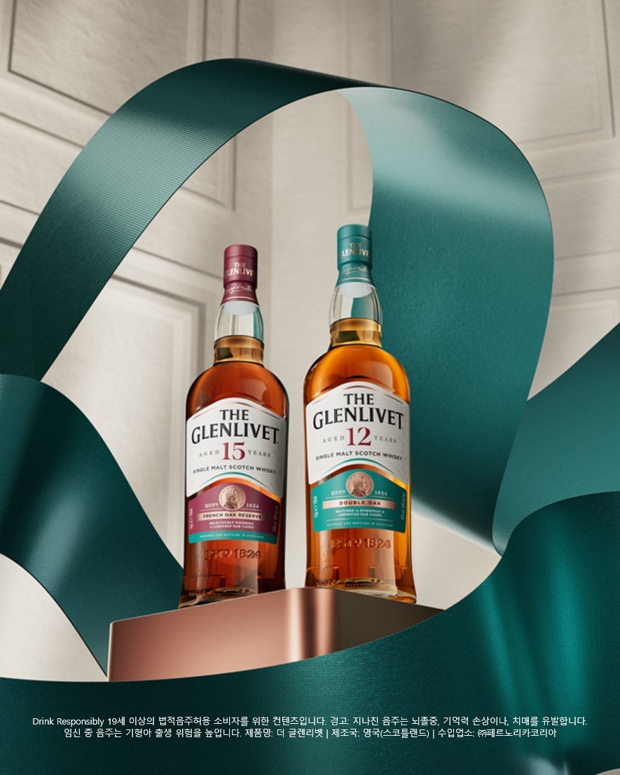
Pernod Ricard Korea has unveiled a new visual identity(VI) for ‘The Glenlivet,’ its single malt Scotch whisky brand.
The new identity retains the brand’s existing bright and vibrant colors while enhancing consistency across the product range and reinforcing its premium image. The brand’s signature turquoise hue has been applied more prominently across the entire range, while distinct key colors highlight the character of each expression. The turquoise of The Glenlivet 12 Year Old, burgundy of the 15 Year Old, and navy of the 18 Year Old are designed to complement the white labels and golden whisky.
Design details have also been refined. The packaging features a wave texture inspired by the flow of the River Livet, while the labels incorporate a design depicting the river’s flowing waves. The brand stamp, product names, and age statements have also been made more prominent. In particular, the key colors of each expression are applied in banner and strip elements, creating a cohesive family look that connects the products when displayed together. The new design aims to strengthen The Glenlivet’s distinctive presence in the single malt whisky market, where numerous ‘Glen’ brands compete.
The new packaging will be introduced sequentially in the Korean market, beginning with Chuseok gift sets.